
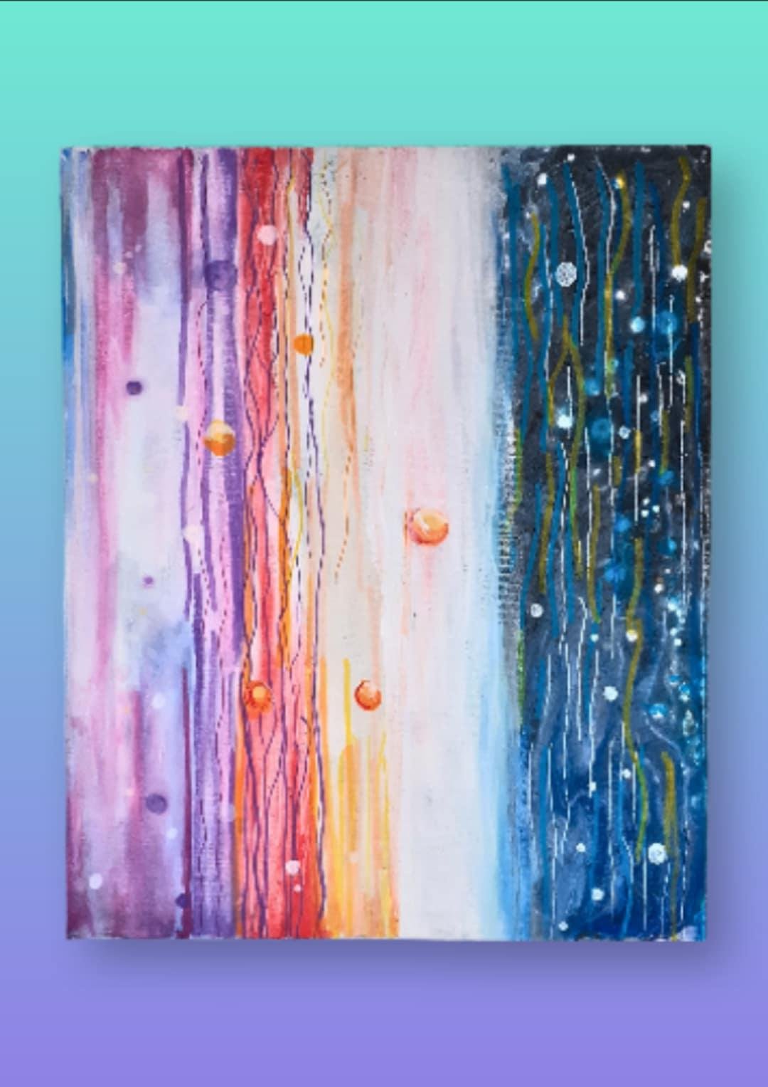
Vertical Abstract Acrylic Painting – Purple to Blue Gradient with Textured Lines Modern Atmospheric Wall Art 12×16
£75.00
A vibrant abstract piece that moves from soft purples to fiery reds to deep blues in vertical, atmospheric bands. Fine linear textures and glowing accent dots give it a structured, almost digital feel, while the colour transitions create depth and movement. Painted on a 12 × 16″ boxed canvas, it’s a striking, modern artwork that works beautifully in a variety of spaces.
The painting feels like a portal—each vertical band of colour shifting from soft purples to fiery reds to deep ocean blues, as if you’re looking through a window into layered atmospheres. The structured lines and glowing dots give it a sense of movement and intention, more like a digital landscape or an otherworldly skyline than a traditional acrylic pour. It’s abstract, but it feels alive—rhythmic, dimensional, and full of quiet energy.
How the Painting Was Created
- Surface — 12 × 16″ boxed canvas with deep edges, giving the piece a clean, modern profile that hangs beautifully without a frame.
- Medium — Acrylic paints poured and guided into controlled vertical bands, allowing colour transitions to stay crisp rather than chaotic.
- Base Layer — A smooth gradient foundation was laid down to help the warm and cool tones blend seamlessly from left to right.
- Colour Work — Purples and pinks shift into reds, oranges, and yellows before dissolving into deep blues and blacks, creating a sunrise‑to‑cosmos effect.
- Texture Technique — Fine vertical lines were pulled through the paint to add structure and rhythm, giving the piece its “digital” or atmospheric feel.
- Accent Details — Small orange and white dots were added as focal points, giving the viewer visual anchors—like distant lights, planets, or sparks.
- Finish — A protective varnish enhances the saturation and preserves the layered textures.
Display Notes
The boxed canvas stands out beautifully on its own thanks to its depth. Diffused lighting works best, especially on the darker blue areas, to avoid glare and keep the colours rich. The piece can be hung vertically as shown, but rotating it 180° creates a completely different visual flow—common with abstract pours and often surprisingly effective.
| Weight | 1 kg |
|---|---|
| Dimensions | 30.48 × 40.64 cm |


Reviews
There are no reviews yet.